Project Overview
Project Type: Academic
Role: UX Researcher, Design Strategy, UX/UI Designer
Timeline: 10 Weeks
Tools: Figma, InVision
Plantful was my capstone project that I completed while attending BrainStation, in tandem with other coursework. Plantful is an iOS mobile app designed to support millennial indoor gardeners with managing their hobby in one convenient place. It supports tracking plant maintenance, accessing relevant plant information, in addition to fostering connections with other indoor gardeners.
Design Process
The Design Thinking and Double Diamond processes were utilized throughout this project.
These methodologies allowed me to be comfortable with being uncomfortable - in order to effectively navigate ambiguous problem spaces, revisit and question previous work, all while keeping the focus on the user throughout.
Discover
Problem Space
Millions of millennials began indoor gardening as a hobby in order to keep busy throughout the COVID-19 pandemic.
While taking care of houseplants fulfilled this original goal, many additional benefits were uncovered - including increasing skill, elevating mood, and decreasing anxiety. Now that many have solidified indoor gardening as a permanent hobby that will extend past the pandemic, they are experiencing the lack of typical markers that accompany long-term hobbies in adulthood - including connection, support, and camaraderie.
The Design Challenge:
"How can we better support millennial indoor gardeners who started a long-term hobby under less than ideal circumstances?"
Secondary Research
Before digging in further, I wanted to ensure this was a problem space worthy of design intervention. Secondary research uncovered numerous findings, which are summarized below:
Connections
1/4 millennials have difficulty maintaining connections throughout the COVID-19 pandemic
Loneliness
30% of millennials admitted to feeling lonely before the COVID-19 pandemic began
Milestones
Millennials are delaying major milestones in life - including marriage and having children
Urban Living
Millennials are increasingly inhabiting urban cities, live and work in apartments, and have demanding jobs
Millennials
Millennials now make up 29% of all gardenings households; which is a $1.7B industry
Mental Health
Plants in a home or office support improved health outcomes - including decreasing stress and reducing recovery time
Our secondary research confirmed that this problem space is one worthy of pursuing. It’s clear that millennials are experiencing challenges as a result of societal changes coupled with the COVID-19 pandemic, and that gardening is a hobby that easily fits into their existing lifestyle while providing health benefits.
From initial findings, I generated my first how might we statement.
How Might We:
"HMW connect millennials that are new to indoor gardening with experienced gardeners, in order to foster and create a supportive community?"
User Interviews & Insights
I wanted to learn more, so my next step was to conduct Zoom interviews with millennial indoor gardeners in order to gain attitudinal and qualitative feedback about their experiences.
I prepared a list of open-ended and general questions to ensure the conversation felt casual, but also to ensure sufficient time for follow-up (aka the “why”) questions - as these are typically where the best insights come from. After conducting my user interviews, I organized my findings into pain points, motivations, and behaviours. Findings were grouped into themes, with insights derived from each theme.
Accurate Plant Diagnosis
People seek and trust the information of other plant owners to properly diagnose plant issues, due to their shared experiences as well as to mitigate the frustrating experience of searching for advice online

Connection to Nature
Indoor plants are a means to connect with nature while at home, as previous ways of connecting with nature - like travelling and commuting - have been severely disrupted due to the pandemic

Family Connection
Millenial indoor gardeners find themselves connecting more with multi-generational family members due to their shared interests of indoor gardening
Sharing Cuttings
Indoor gardeners have a desire to connect with other gardeners in order to give and receive plant cuttings
(plant cuttings = a subsection of a live plant that can grow into a new plant)
Time to Revisit and Question
From user interview insights, it became clear that my original how might we statement did not accurately reflect the lived experiences of my users.
While there was interest in participating in a community, users were experiencing more urgent pain points that they would prioritize first - such as diagnosing plant issues, and frustrating experiences searching for plant information online.
I decided to remove the community aspect of my how might we statement to better reflect the current needs of users in seeking to improve their skills and maintain their plants.
💡 Key Learning: Trusting the design process and questioning my assumptions before moving forward ensured that the digital solution developed would be derived from the correct problem space
Updated How Might We:
"HMW connect millennial indoor gardeners with one another to share experiences, in order to improve gardening skills?"
Define
Persona & Experience Map
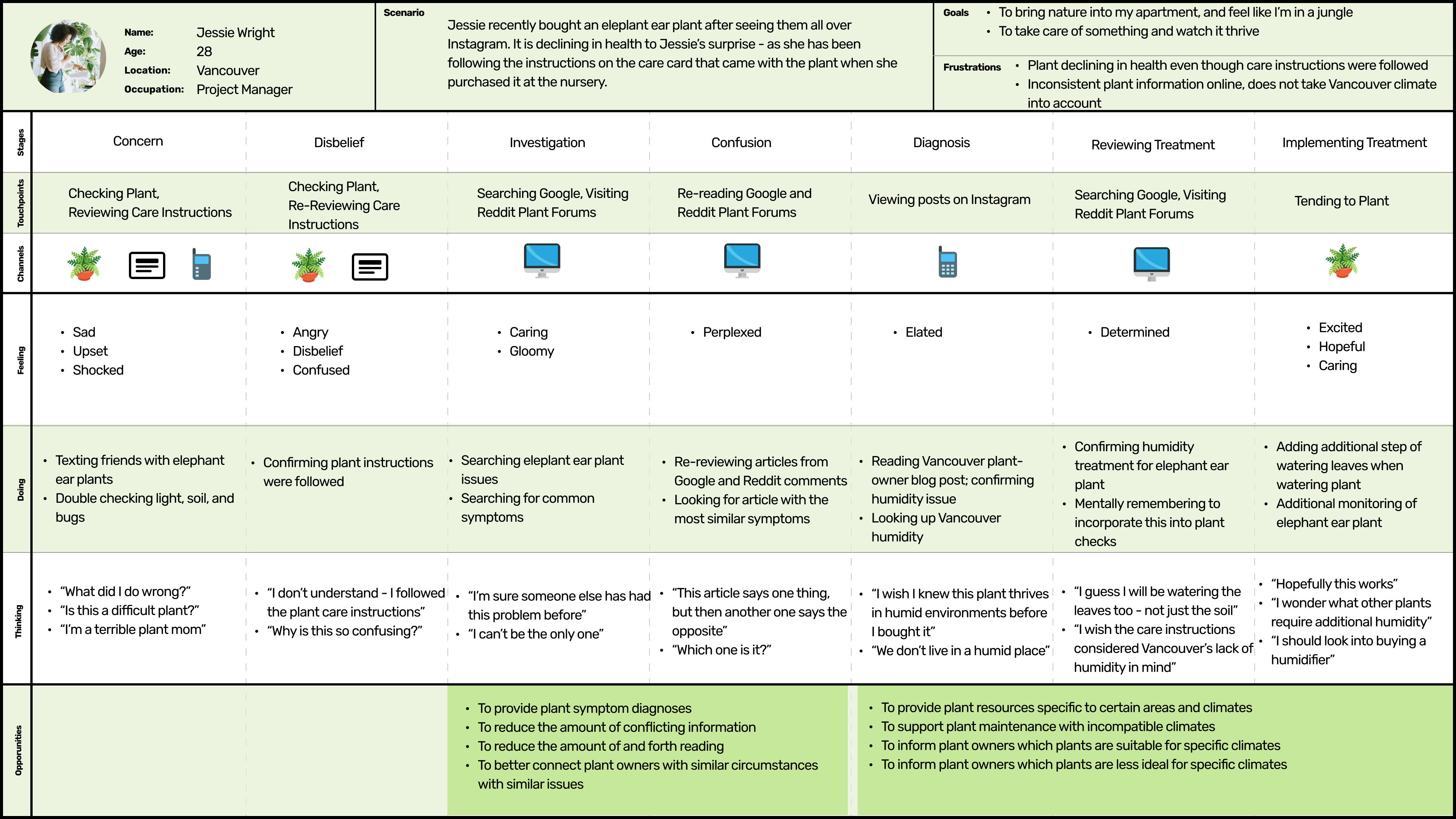
To ensure we designed for and kept our users top of mind, I developed a persona with demographic information and insights extracted from user interviews. I also created an experience map to aid in visualizing the experience, in order to help identify all possible opportunities for design intervention.
Persona

Experience Map
User Stories & Task Selection
Using my refined HMW statement and reviewing our persona Jessie and her current experience with indoor gardening, I created 30 user stories under multiple epics to help inform the core functionalities of my design solution.
From the user stories generated, I identified several epics but chose to focus on the Diagnose Plant Issue epic because it was one of our user interview themes, was cited by all users as their biggest pain point, and directly ties to our updated HMW.
Core Epic: Diagnose Plant Issue
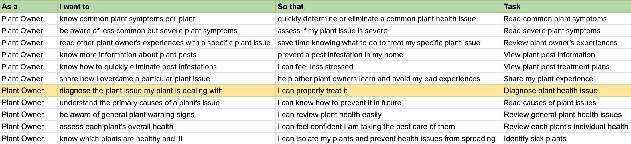
From this epic, the primary task I chose to move forward with was diagnose plant health issue.
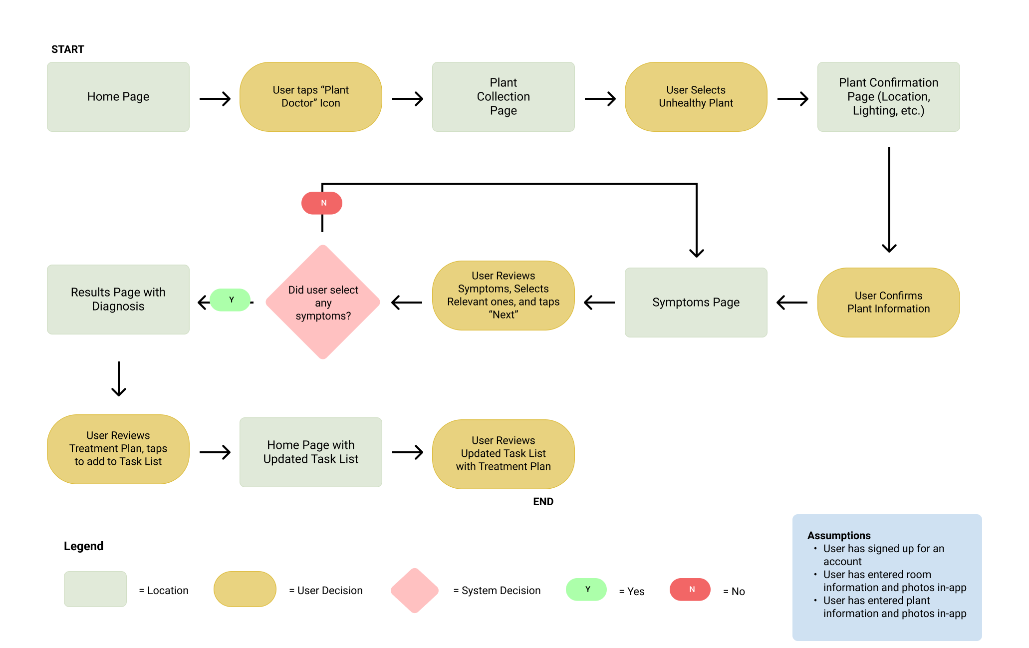
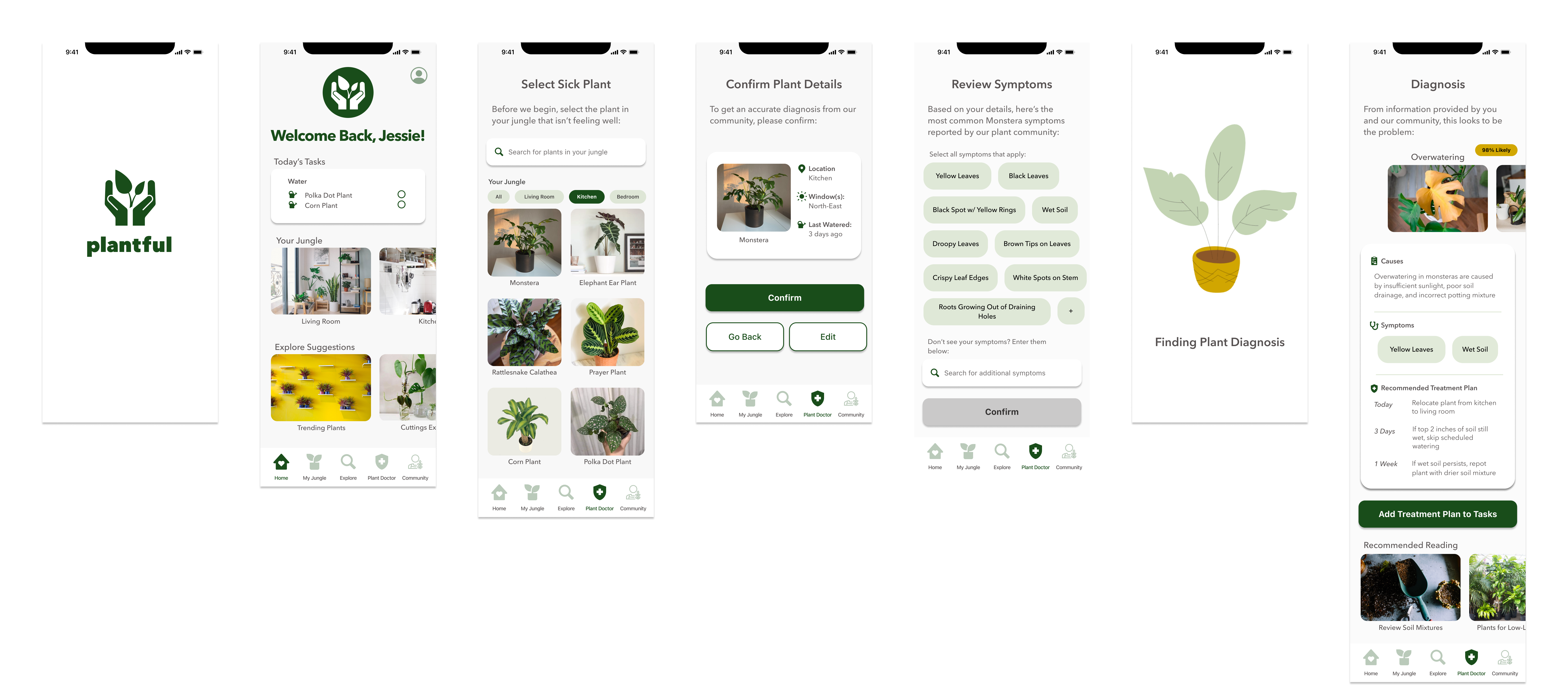
Task Flow
After identifying my primary task, I created a task flow to help understand how users would complete this task with the support of our digital product. This would ensure that the focus would remain on designing for the intended solution throughout the next stages of the process, and not get caught up in the less important details.
Task Flow: Diagnose Plant Health Issue
Develop
Exploration Sketches
Now that I had a clear idea of the task our app would be solving for, I began sketching different variations of potential solutions. Inspiration was pulled from existing UI components, plant apps currently in the market, and applications that show a lot of information and imagery in an easy-to-digest way - such as Airbnb and YouTube.
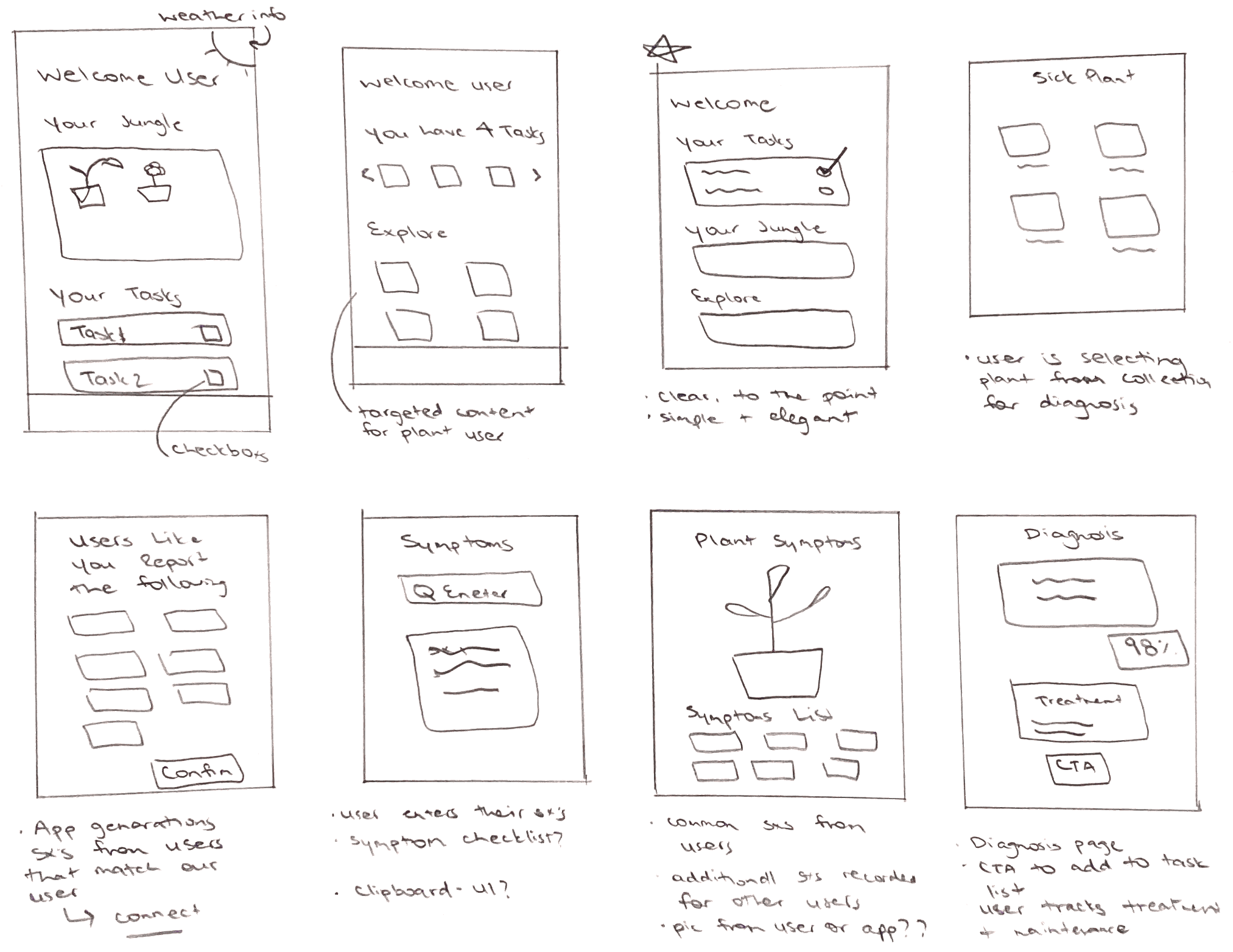
My First Prototype
After further iterative sketches and additional review of UI inspiration, I created my first version of my prototype.

User Testing
After completing my first gray-scale prototype, I put it to test with two rounds of user testing - receiving feedback from 10 users in total. This was an important step, in order to identify problems, uncover opportunities for refinement, and to better learn about not just what users say, but what they do.
User tests were recorded over Zoom with users participating in screen sharing. This allowed the opportunity to observe behavioural hints - such as slight pauses, that may indicate usability issues.
Testers were given a set of 5 tasks to complete. While all users were able to complete the tasks, there were some key changes we implemented from feedback in order to improve the overall experience.
Major Change #1: Select Sick Plant Page
While this task was quickly completed by all users - valuable feedback was provided throughout both rounds of testing that there could be minor improvements to help a user find their plant more easily. This was important to address as our target user owns many plants, and would become frustrated over time scrolling this page to find a specific plant.

Major Change #2: Confirm Plant Details Page
Users found this part of the flow confusing upon choosing their sick plant - the two screens felt like a lot of information, with feedback provided that this was unnecessary. I iterated upon this in the second version by replacing the plant selection page with a pop-up modal.
User feedback during the second round of user testing confirmed this change did not fully resolve for it, with some users finding the pop-up modal feeling similar to a cancellation experience. After additional research - in the third version, I incorporated information from all previous screens into one page - allowing the user to confirm, edit plant details, or go back to the previous page in one place.
💡 Key Learning: Less is more - the simpler the design, the better the user experience

Major Change #3: Diagnosis Page
While users found the information in the diagnosis card helpful, many noted there could be improvements in how causes, symptoms, and treatment plan were separated, thus being more clearly identifiable - all iterations aimed to improve this visibility. Additionally, many found that the 98% likely copy was not bold enough. Finally, the “Explore” and “Community” CTA’s on the first version caused confusion, which I updated with articles related to the diagnosis. Feedback from this area taught me the importance of copy as well as clear separation of information.

Final Wireflow
After sketching, prototyping, two rounds of usability testing, and multiple iterations - here is the final wireframe that will be designed in hi-fidelity.

Deliver
Visual Identity
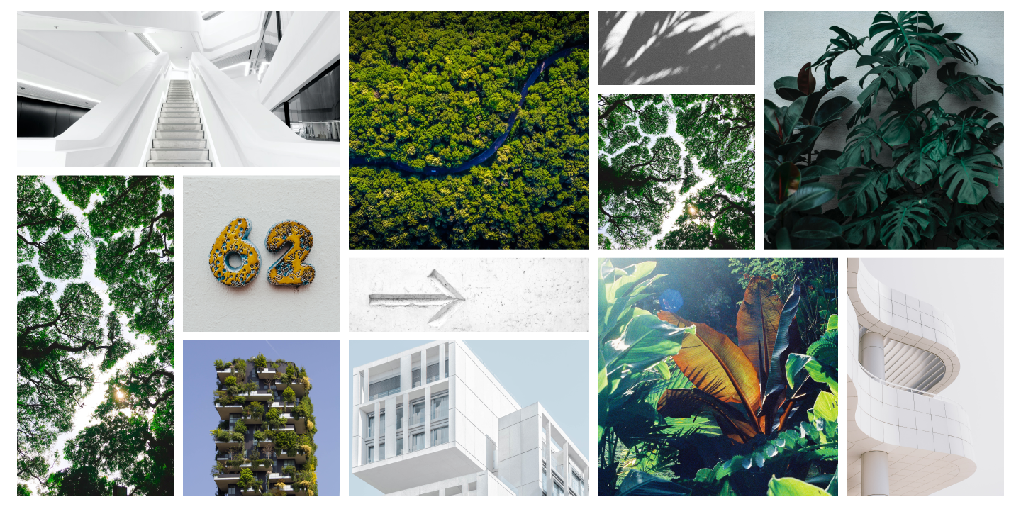
After prototyping, testing, and multiple iterations, I had arrived at my final prototype. It was time to bring it to life, beginning with creating a visual identity. Upon reflection of the problem space, our target user base, and insights derived from interview insights, I carefully chose these words to embody the visual identity:
Calm, Clean, Effortless, Friendly, Helpful
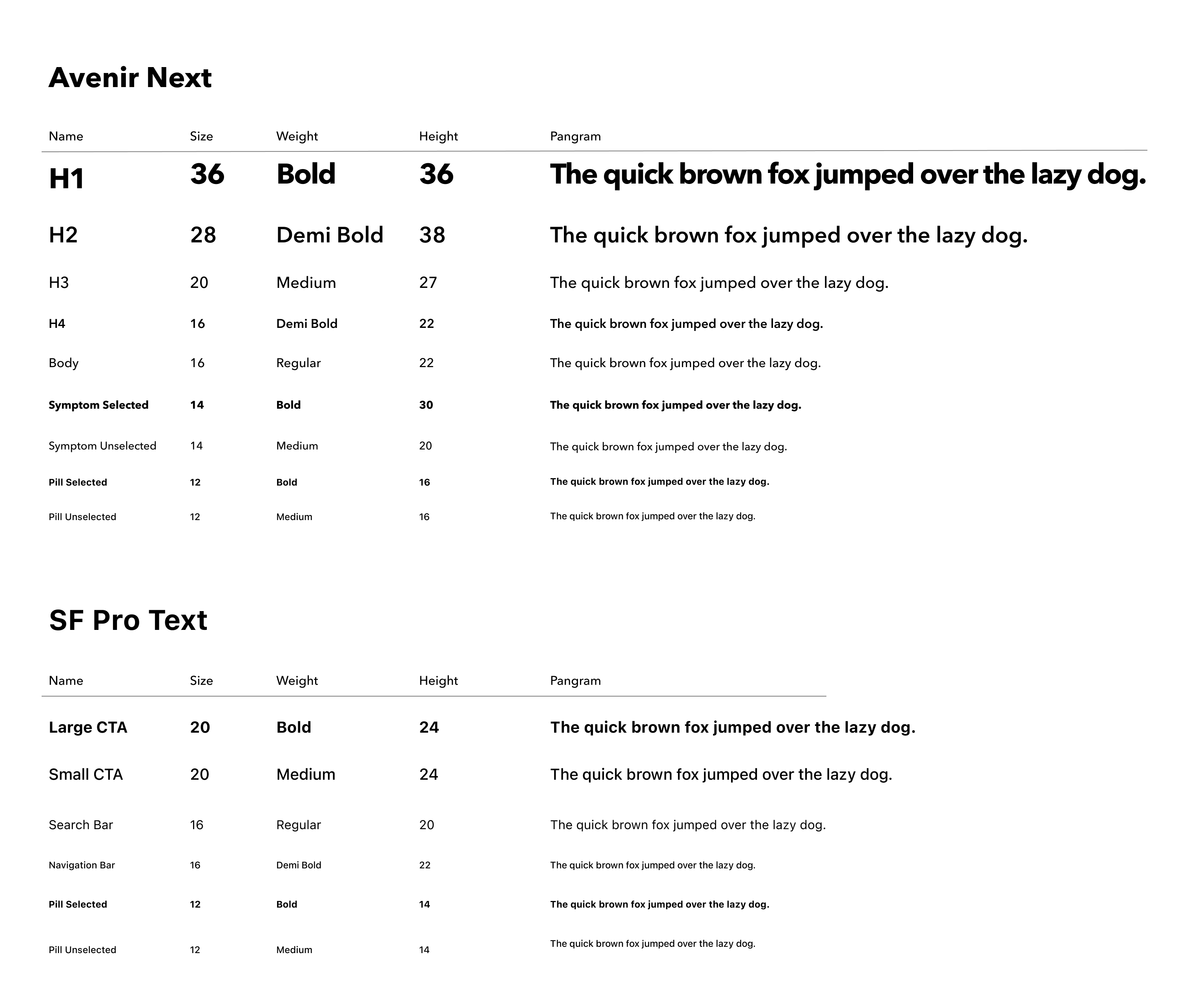
These adjectives guided me throughout the next phases of curating a moodboard, pulling from my moodboard a colour palette, and determining appropriate typography.
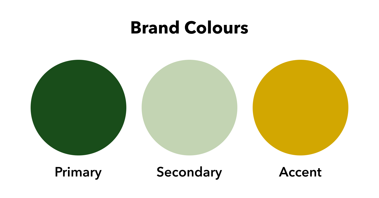
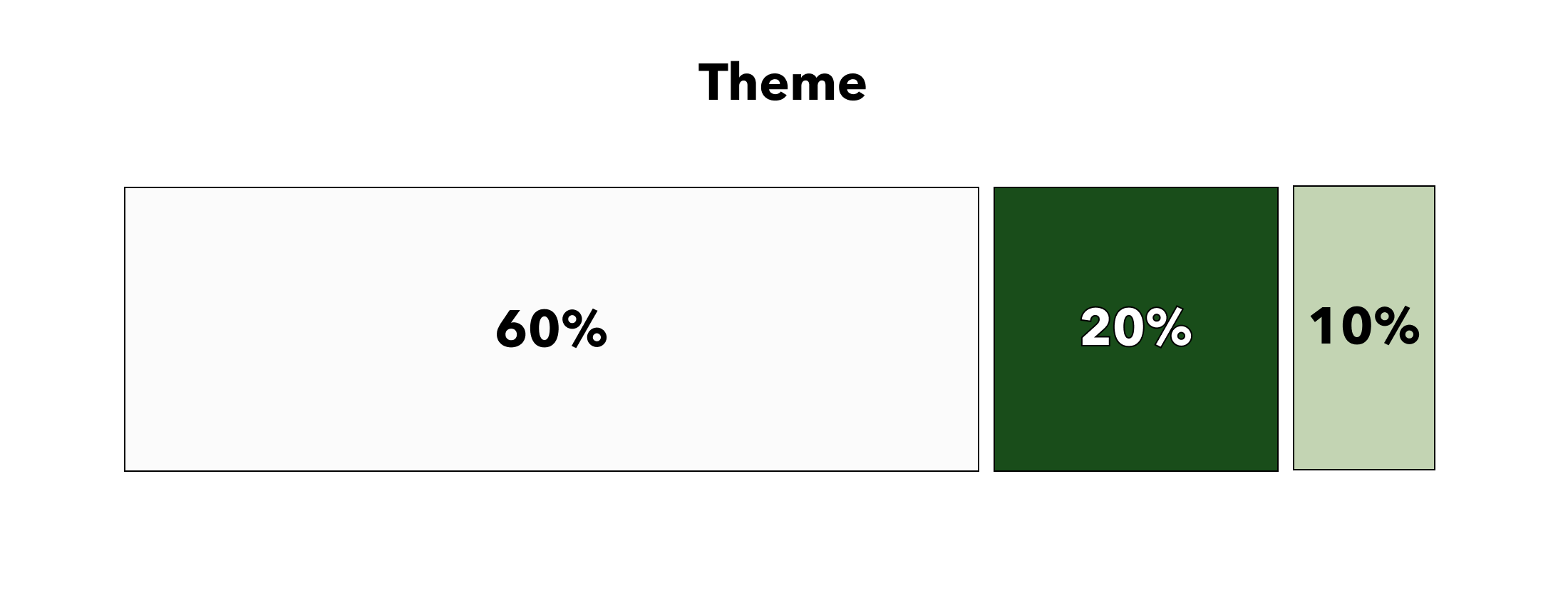
Colour Injection
Now that brand identity, colours, and appropriate typography were chosen, I thought carefully about how to inject these colours into the app. Knowing our brand adjectives, as well as the fact that there are lots of images throughout, I wanted to ensure that our use of colour did not compete for user attention and take away from our content, nor did it detract from our brand values.
I chose to use brand colours sparingly throughout the app, pulling inspiration from apps like Airbnb and YouTube, which showcase images and thumbnails thoughtfully and clearly but also do not detract from the overall experience.
Brand Name & Wordmark
After exploring and testing multiple names, Plantful is the name that I chose. Plantful incorporates two words I want my app to embody - plants and helpful - and it rolls off the tongue in a natural way. It sounds like a name that could be injected naturally into conversations, similar to Netflix and Google.
A clean bold typeface was used to embody Plantful’s logo. To reflect the helpfulness of the app, the letter “u” was replaced with an icon of hands with a plant, which I adjusted to better reflect the letter “u”, from design feedback. This set of hands then became our app icon.
Wordmark
App Icon

Reverse Wordmark

White & Black Wordmark

Black & White Wordmark
Hi-Fi Prototype
The last and exciting step in building Plantful’s visual identity is to apply colours to the final prototype. Please see below for the app in high-fidelity.
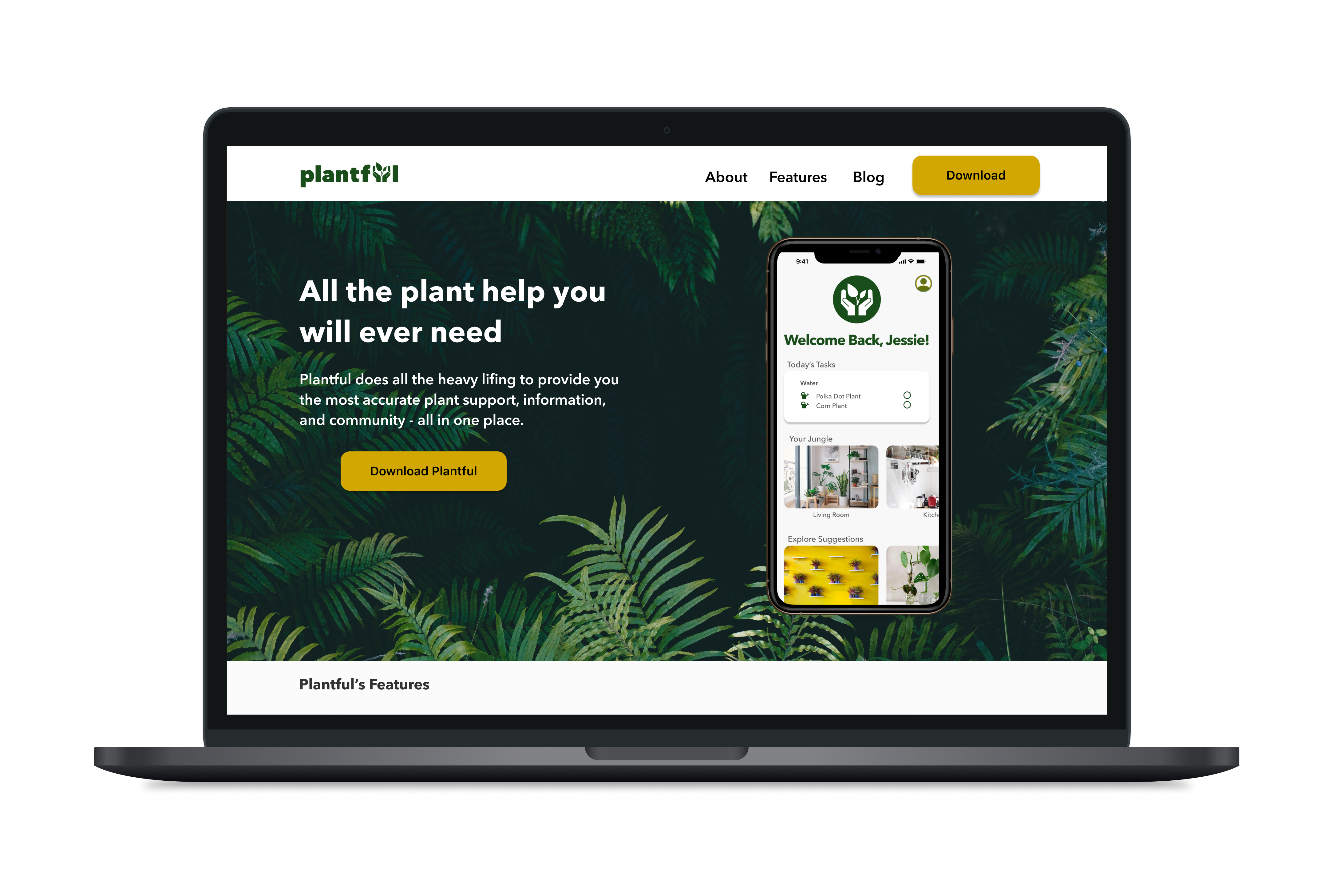
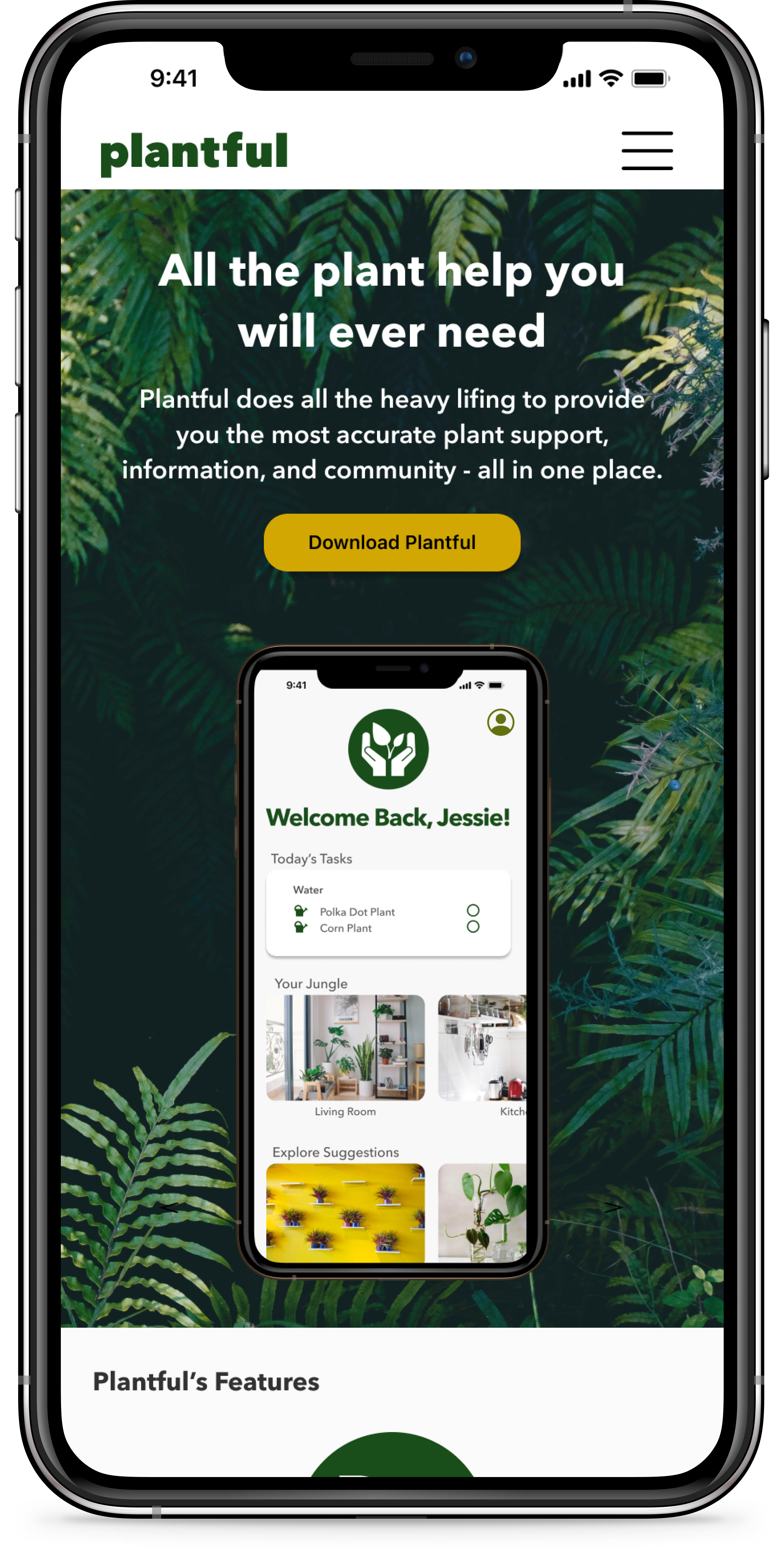
Responsive Marketing Site
The next step was to create a marketing website. I employed a similar strategy as I had for the previous prototype - researching UI inspiration, revisiting user interview notes, as well as reviewing my recently created brand visual identity.
Upon reflection of my user interview notes, one common theme throughout was users using the word "jungle" to describe their plant collection. I decided to incorporate this theme into my website with a leafy background, reminiscent of a jungle, for the hero image.
Plantful’s marketing website includes app features, support information, as well as up to date blog content. This website will effectively support users, while also generating net new users through SEO marketing.
Conclusion
Design Impact & Future Thinking
Through extensive research, user interviews, and usability testing, I’m proud of the progress I made in solving a real problem with the creation of a digital solution. It’s clear that there are many by-products of the pandemic that will remain, and we as a society will have to adjust accordingly. There is so much potential for technology and UX design to bridge this gap, and I’m excited to see it unfold over time.
While I am proud of the work done, there is still more improvements that can be made to Plantful, including:
- Additional user testing of primary task flow to ensure appropriate use of colour
- Design of additional tasks - community feature, sharing plant cuttings, and adding plants in a user’s jungle
Key Learnings
Within the span of 10 weeks, I successfully applied the foundation blocks of UX Design to my problem space, creating an end-to-end digital solution. Throughout this process, I learned many things about myself and UX:
🏅
Chase progress, not perfection
What makes UX such an interesting industry is that it is rooted in people, and people are not static - they will be subject to change. Don’t chase perfection, but instead aim for progress towards the problem set before you.
📈
Design is non-linear
The double diamond process was a great framework to use as I applied my learnings. I questioned, revisited, sought feedback from others, and sometimes had to take a couple of steps backward in order to move forward. Identifying and solving problems will never be a clear-cut process, and I am happy to have grasped this early on.
👤
You are not your user
This was a fantastic learning experience in making design decisions based on user insights and feedback, and not my own thoughts or opinions. Rooting decisions from interview findings, feedback sessions, and designer input allowed me to view the same problem from multiple perspectives, which improved my final product.
Want to work together?
Get in touch for opportunities, or just to say hi 👋